Greige is In!
There is no doubt that the hugely popular Sherwin Williams paint color “Agreeable Gray” (SW7029) has been making its rounds in the interior design industry… Quick interior trends may come and go by season, but we have seen the hugely sought after entirely gray interiors stay around for a number of years now.
That is about to change though! Cold and blue-toned grays are well and truly on their way out of trend and we’re seeing a lot more emphasis around warm grays, light beiges and more earthy tones.
Today we’re taking a closer look at the Sherwin Williams “Agreeable Gray” (SW7029) paint color and how we’re going to see more variations and tones of similar colors very soon. This color is a mix of beige with a hint of gray – hence the term “greige”! – the undertone of beige helps to cut through any blue undertones of the main gray which stops the color from looking too cold.

Why we love it!
We love Agreeable Gray as a color for interior design projects because it’s extremely warming. It’s a relatively easy color to work into a space and you can accessorize with almost any other color without them clashing. It is a sophisticated color that is a great alternative for those looking to steer away from the blue-toned grays we have seen for the last five or so years. With gray moving its way out of trend now it’s the perfect time to make the switch to a greige color and add some warmth and comforting tones to your spaces.

How to make the switch…
Transitioning from the cold and stark gray colors may seem daunting and somewhat out of your comfort zone but it is well worth doing gradually. Start with one room at a time and slowly start to make the switch from gray to more beige tones through your accessories and decorative pieces. This will help to avoid any overwhelm with the transition.
If you’re ready for a big project redecorating hallways and foyers with a warmer gray toned paint color can make all the difference. This also provides a warm welcome for guests.
What to watch out for…
Whenever you’re thinking of updating colors in your home, there are some key considerations that should be taken into account…
Particularly with beige and earthy tones it’s important not to fall into the “muddy” trap with warmer colors like Agreeable Gray. It’s too easy to mix similar mud-like colors together and create a really warm interior but these can often look more “muddy” than well thought through.
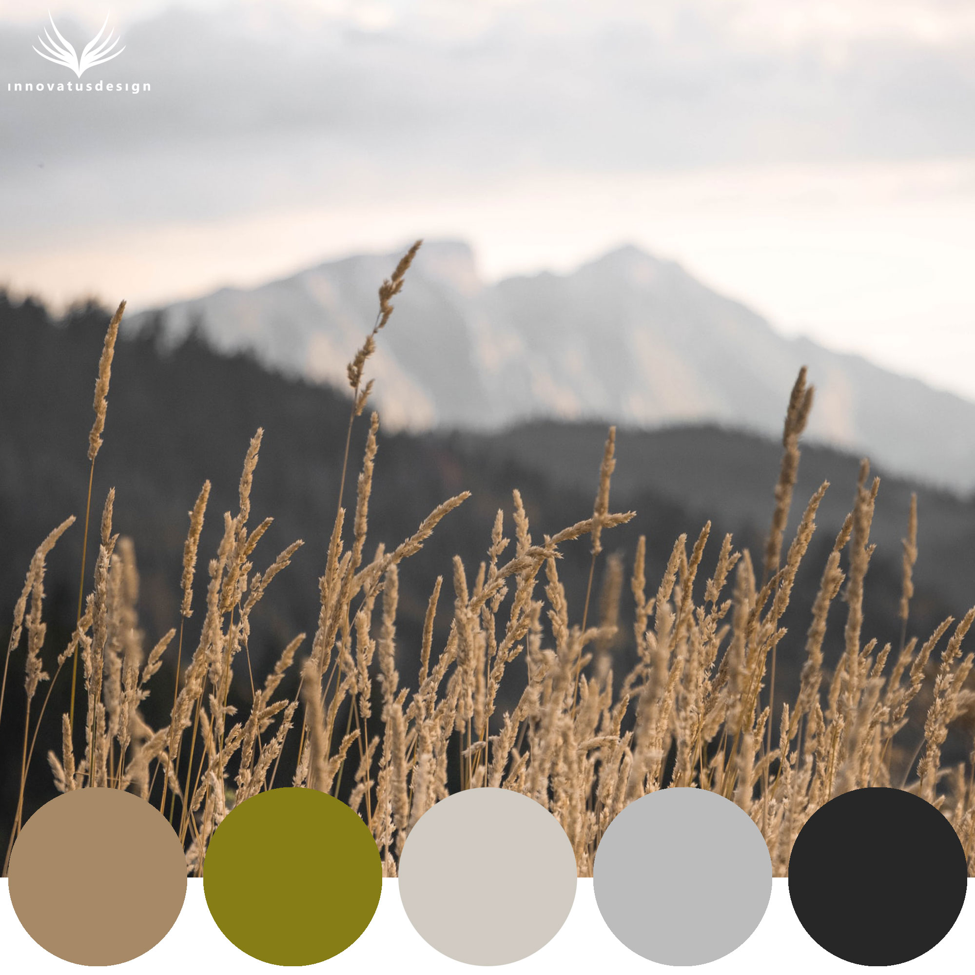
Always pair a warm gray / light beige with black, white or cream as other neutrals and a key accent color to help balance the whole look.
What do these colors mean?
Color psychology is very important in interior design because colors can change the whole atmosphere and feeling of a room – it’s critical to get it just right.
Gray on its own represents neutrality and balance. Used on its own it can be seen as dull and depressing because of the lack of color, it is a variation of monochrome. It is emotionless and perceived as formal and conservative due to its original appearance in lifeless offices.
However, beige as a color represents flexibility, calmness and dependability. It is a calming and relaxing color that encourages stable and nourishing energy. There is no wonder why beige has been known to be traditional or classic in the past because of these positive and nostalgic associations.
Although greige is neutral in shade, it provides a sense of balance and calmness. This ultimately creates one of the most versatile neutral paint colors that provides a good basis from which to work from and build a cohesive interior with.
Accent color pairings…
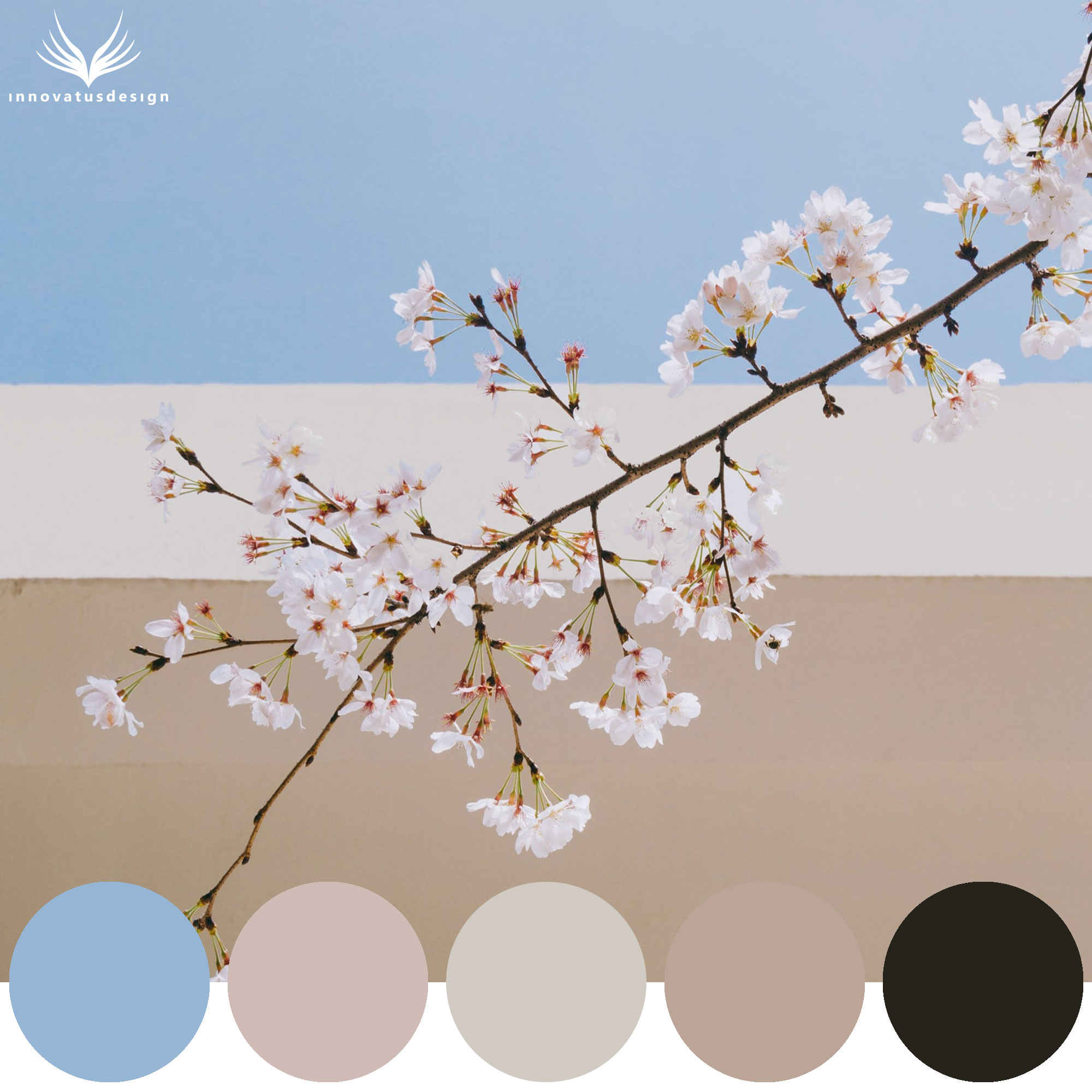
From the foundation of greige, add an extra layer to a space with one or two key accent colors. Colors which work well with Agreeable Gray are:
- Burgundy Red
- Dusty Rose
- Light Blue
- Sage Green
Pair Agreeable Gray with rich, deep accent colors to create a highly sophisticated interior. Black, white and cream will all work extremely well with this color too if you’d prefer to keep the color palette truly minimal.

Ways to make this color last in your home…
Sherwin Williams Agreeable Gray is a timeless paint color that will pair well with any accent color. Ground the warmth of this with black or dark furniture (coffee and console tables) and even it out with light cream or white textile pieces.
A classic greige paint color will last you a lifetime – it’s one that you’ll love year on year. Whether it’s for a living room, classic dining room, nursery or bedroom – Agreeable Gray and other greige tones work for any interior space.
You might like:
(Click on the image to purchase.)
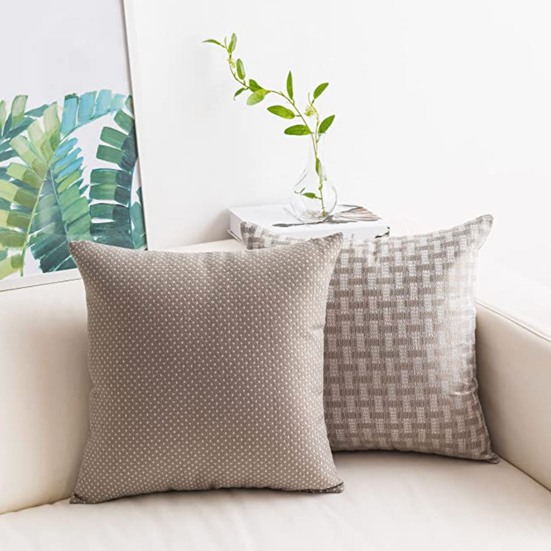
Textured Decorative Pillows
Swapping your decorative pillows for warmer shades of beige will help you to easily make the switch!
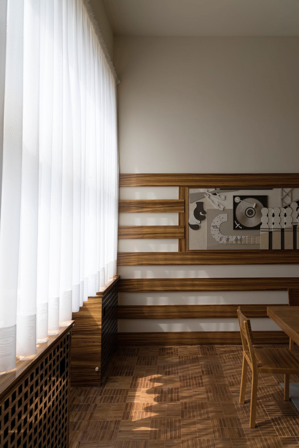
Linen Textured Drapes
Using curtains for additional warmth through the color and texture is a great way to transition a space from cooler grays to warm and earthy tones.
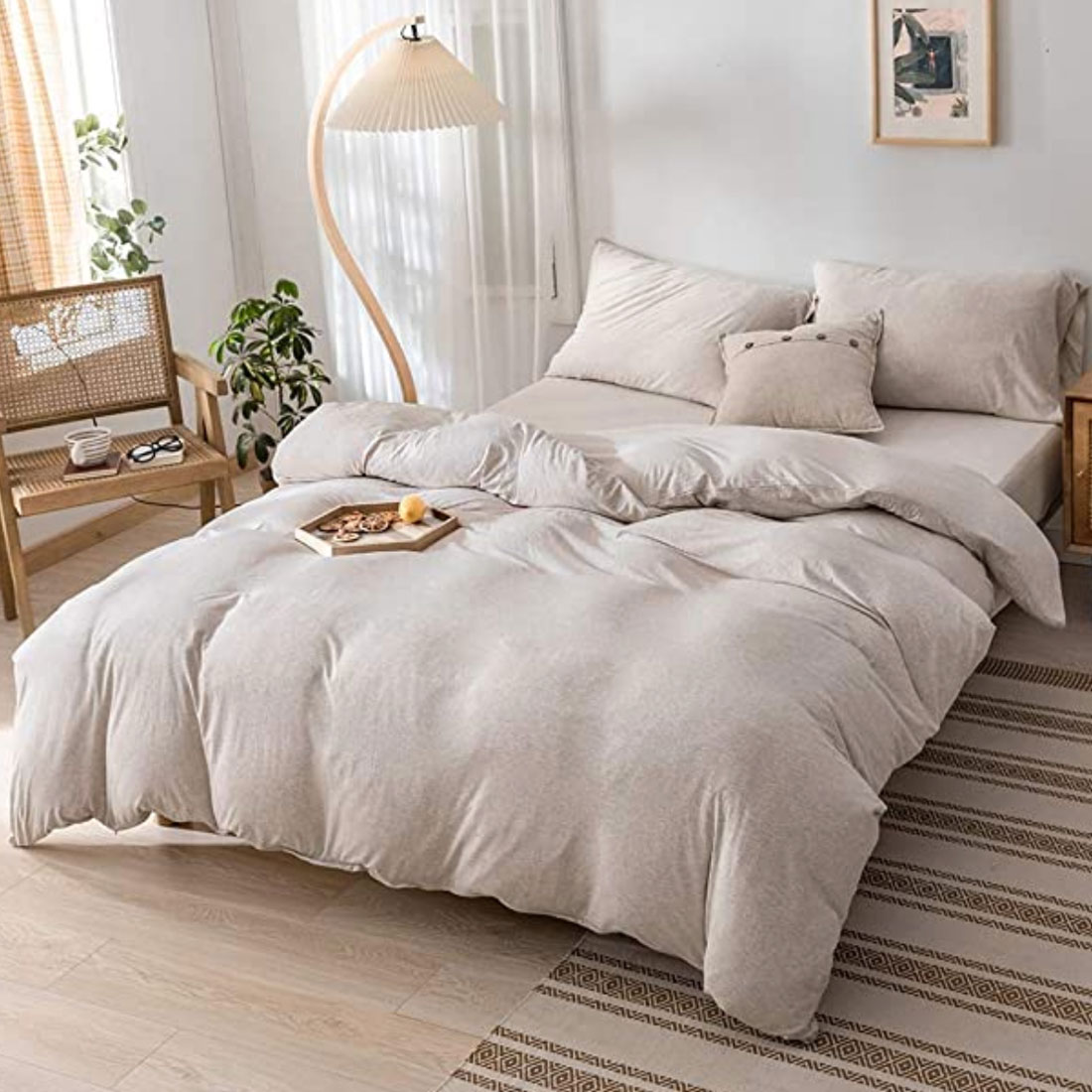
Cotton Duvet Cover Set
One of the easiest ways to update your bedroom’s design is by switching your bed sheets for a new set. We love this light coffee color as it helps to create a warm sanctuary.

